|
 
- UID
- 2
- 积分
- 2945657
- 威望
- 1422865 布
- 龙e币
- 1522792 刀
- 在线时间
- 13794 小时
- 注册时间
- 2009-12-3
- 最后登录
- 2025-4-25

|
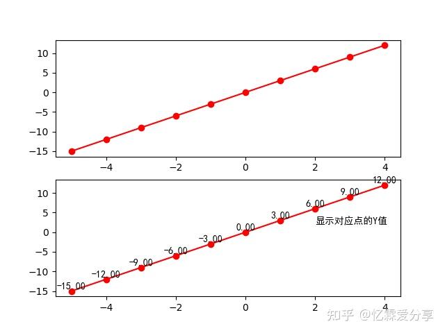
文本标注
使用 text() 在绘制区域内标注文本。- import matplotlib.pyplot as plt # 为方便简介为plt
- import numpy as np # 画图过程中会使用numpy
- import pandas as pd # 画图过程中会使用pandas
- #使用numpy产生数据
- x = np.arange(-5,5,1) # 定义x数据范围
- y1 = x*3 # 定义y1数据范围
- #创建窗口、子图
- fig = plt.figure() # 先创建窗口一个窗口
- ax1 = fig.add_subplot(2,1,1) #通过fig添加子图,参数:行数,列数,第几个。
- ax2 = fig.add_subplot(2,1,2)
- plt.rcParams["font.family"]=["SimHei"] # 确保图中中文字体正确显示
- ax1.plot(x,y1,color = 'r',marker = 'o') # plot()画出曲线,线颜色为红色
- ax2.plot(x,y1,color = 'r',marker = 'o') # plot()画出曲线,线颜色为红色
- for x, y in zip(x, y1):
- ax2.text(x, y + 0.2, '%.2f' % y, ha='center', va='bottom')
- # ha: horizontal alignment水平方向
- # va: vertical alignment垂直方向
- ax2.text(2,2,'显示对应点的Y值') # 在坐标(2,2)处标注'显示对应点的Y值'
- plt.show() # 显示图像
注意,通过申明字体,确保图中中文字体正确显示,防止出现乱码。plt.rcParams[“font.family”]=[“SimHei”]
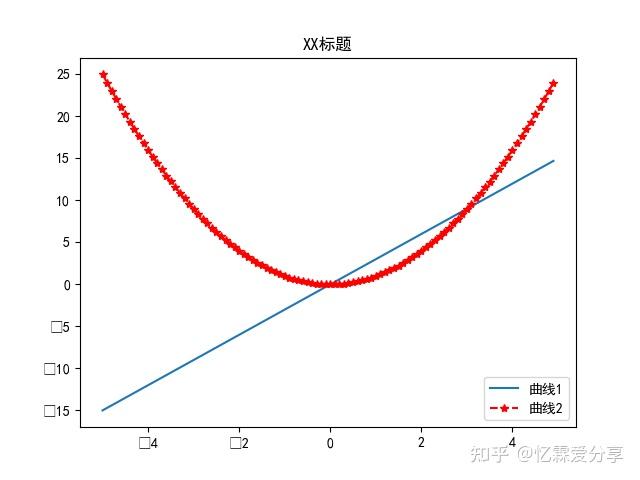
4 图例
使用 legend() 显示两条曲线图例。- import matplotlib.pyplot as plt # 为方便简介为plt
- import numpy as np # 画图过程中会使用numpy
- import pandas as pd # 画图过程中会使用pandas
- x = np.arange(-5,5,0.1) # 定义x数据范围
- y1 = x*3 # 定义y1数据范围
- y2 = x*x # 定义y2数据范围
- plt.rcParams["font.family"]=["SimHei"] # 确保图中中文字体正确显示
- #创建窗口、子图
- fig = plt.figure() # 先创建窗口一个窗口
- plt.plot(x,y1) # plot()画出曲线
- plt.plot(x,y2,color = 'red',marker = '*', linestyle = '--') # 设置曲线颜色、线标记,线样式
- plt.legend(labels=['曲线1','曲线2'],loc='best') #best表示自动分配最佳位置
- plt.show() # 显示图像
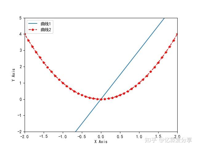
5 坐标轴
使用 xlim() 和 ylim() 设置坐标轴范围,使用 xlabel() 和 ylabel() 设置坐标轴名称。- import matplotlib.pyplot as plt # 为方便简介为plt
- import numpy as np # 画图过程中会使用numpy
- import pandas as pd # 画图过程中会使用pandas
- x = np.arange(-5,5,0.1) # 定义x数据范围
- y1 = x*3 # 定义y1数据范围
- y2 = x*x # 定义y2数据范围
- plt.rcParams["font.family"]=["SimHei"] # 确保图中中文字体正确显示
- plt.rcParams['axes.unicode_minus'] = False # 确保坐标轴正确显示正负值
- #创建窗口、子图
- fig = plt.figure() # 先创建窗口一个窗口
- plt.plot(x,y1) # plot()画出曲线
- plt.plot(x,y2,color = 'red',marker = '*', linestyle = '--') # 设置曲线颜色、线标记,线样式
- plt.legend(labels=['曲线1','曲线2'],loc='best') #best表示自动分配最佳位置
- plt.xlim((-2,2))
- plt.ylim((-2,5))
- plt.xlabel('X Axis')
- plt.ylabel('Y Axis')
- plt.show() # 显示图像
6 标题
使用 title() 显示曲线标题。- import matplotlib.pyplot as plt # 为方便简介为plt
- import numpy as np # 画图过程中会使用numpy
- import pandas as pd # 画图过程中会使用pandas
- x = np.arange(-5,5,0.1) # 定义x数据范围
- y1 = x*3 # 定义y1数据范围
- y2 = x*x # 定义y2数据范围
- plt.rcParams["font.family"]=["SimHei"] # 确保图中中文字体正确显示
- #创建窗口、子图
- fig = plt.figure() # 先创建窗口一个窗口
- plt.plot(x,y1) # plot()画出曲线
- plt.plot(x,y2,color = 'red',marker = '*', linestyle = '--') # 设置曲线颜色、线标记,线样式
- plt.legend(labels=['曲线1','曲线2'],loc='best') #best表示自动分配最佳位置
- plt.title('XX标题')
- plt.show() # 显示图像
|
|
 |
|  |
| 


 微信:
微信:
 2025年最全的Python编程与程序化(量化)教程、视频、源码、课件、资源汇总贴:/thread-152864-1-1.html
 【1981年-2025年欧美期货、程序化、量化杂志、期货电子书等中文翻译目录汇总!】(注册登录后可看!)
 :
: ,
, :
: