|
 
- UID
- 2
- 积分
- 2945657
- 威望
- 1422865 布
- 龙e币
- 1522792 刀
- 在线时间
- 13794 小时
- 注册时间
- 2009-12-3
- 最后登录
- 2025-4-25

|
Matplotlib(绘图库)- 绘制图形
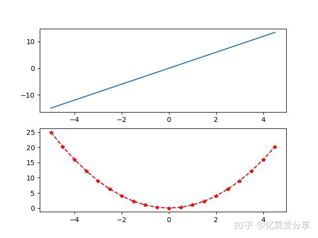
Matplotlib 绘制图形,主要分以下几个步骤。 1.导入相应库 2.产生绘图所需数据 3.创建绘图窗口及子图 4.自定义图形样式(在下一节中详细讲解) 5.显示图像- import matplotlib.pyplot as plt # 为方便简介为plt
- import numpy as np # 画图过程中会使用numpy
- import pandas as pd # 画图过程中会使用pandas
- x = np.arange(-5,5,0.1) # 定义x数据范围
- y1 = x*3 # 定义y1数据范围
- y2 = x*x # 定义y2数据范围
- #创建窗口、子图
- fig = plt.figure() # 先创建窗口一个窗口
- ax1 = fig.add_subplot(2,1,1) #通过fig添加子图,参数:行数,列数,第几个。
- ax2 = fig.add_subplot(2,1,2)
- ax1.plot(x,y1) # plot()画出曲线
- ax2.plot(x,y2,color = 'red',marker = '*', linestyle = '--') # 设置曲线颜色、线标记,线样式
- plt.show() # 显示图像
 |
论坛官方微信、群(期货热点、量化探讨、开户与绑定实盘)
 
|
 |
|  |
| 


 微信:
微信:


 2025年最全的Python编程与程序化(量化)教程、视频、源码、课件、资源汇总贴:/thread-152864-1-1.html
 【1981年-2025年欧美期货、程序化、量化杂志、期货电子书等中文翻译目录汇总!】(注册登录后可看!)
 :
: ,
, :
:

